 |
| Taylor Swift '21' |
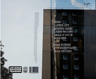
What I have done: I have chosen a different font for the track list as I have used the same font for all the other font and I wanted to create diversity in my use of fonts. I have chosen Type font (Typewriter style font) as this fits with the retro and alternative feel of the digipak. I have included all of the general conventions of a digipak e.g small print (I took inspiration from the Blur and Strokes CD small print), distributors/music label (I chose Virgin music as they have artists like The cult and Thirty seconds to Mars fellow indie/rock artists, also Sly antics have an interview with virgin music to possibly get signed so it is fitting with reality), Bonus footage sticker (I have previously blogged on how I made this) DVD and Disco logos as well as a Bar code.
Next: I will change the ordering of the panel.
No comments:
Post a Comment
Please ensure all comments are moderated.